

Kiev. Ukraine. Ukraine Gate – January 23, 2021 – Technology
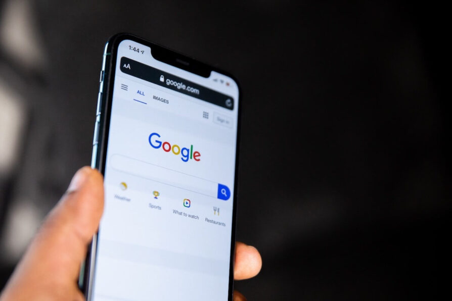
Today, Google announced that it has significantly changed the look of the mobile version of the search to make it easier to use.
The search bar on the search results page will now be visually elevated above the company logo, user account avatar, and other UI elements, giving it emphasis as a key element. In addition, the search filter names below are no longer capitalized. And the selected category now has not a black, but a black underline.
Further, the knowledge panels were given a larger title and generally became more concise. The images used in them now have rounded corners. Google claims that this focuses more on content.
Search results now take up the entire width of the screen. They are still located in the cards, but the rejection of shadows makes the interface less busy. Fonts use the new Google Sans, which is much better perceived than previous fonts.
Google says the goal of the update was to make searching the web more comfortable and intuitive. The new interface will be available when using the mobile web version of the search engine and in the Google application for the next few days.
Read also: Disabling Messages on Huawei Smartphones by Google!


